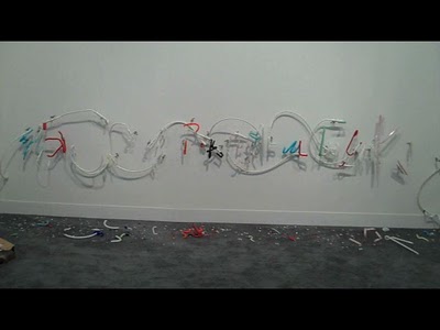
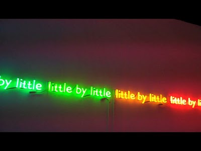
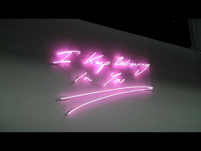
No more! Like a two tone, blown up, gaudy portrait of a celebrity’s face is a tired take on Warhol, writing on the wall seemed like a similar convention by the end of the art fairs. I get it; it’s convenient to spit out your message, sardonic, mocking or inscrutable as it may be, then let the peons wonder. But I am no longer impressed–the same goes for cars being put in galleries (Gabriel Orozco, whoever you were at Independent, and especially you, overhyped BHQF at the Whintey) and for the raven trope (be they stuffed, cast, molded, silhouettes, or talking.) Maybe it was the art fair atmosphere, but I lost the distinction between signage and art about a day into it.
 Ryan Gander
So I suppose it’s clear why Ryan Gander’s piece at Armory, of busted up signage, appealed to me, despite myself, just a little bit. On the whole though, it’s just become a boring way to convey something. All these photos were taken at Pulse and Armory on the last day of the fairs, when I was thoroughly sick of sayings, aphorisms, declarations etc, but Verge, Independent and Scope had their fair share. Does anyone else notice all the writing on the wall? What did you think of it?


Q: If this signage had been invented and executed by me, would it be displayed at an ART FAIR?
A: NO!
(P.S. My imaginary neon-green sign would read “THINK FOR YOURSELF”)
Sorry Christine, that constitutes an institutional critique, which despite supposedly making fun of said medium actually takes part, thus still being boring. Bonus points for neon though. Gotta love the neon.
I am so with you on this one. It is indeed boring & a poor excuse for a work of art.
Thank you–how can there be so many?
Bit like some of the performance art, been done to death and like SO WHAT! YAWN!
What if is was a word that made your body react, salivate, like:
LEMON!
In neon yellow?
…so, you all actually think of these signs as art… that’s really sad…