Richard Serra Drawing at the Met

The artist in his exhibition
My expectations were not high for the Richard Serra Drawing: A Retrospective exhibition at the Metropolitan Museum of Art. His monumental, simple sculptures hardly seemed likely to be very impressive in sketch form. But as the artist has mentioned in interviews, this body of work is separate from his sculpture–and his black or two-toned large drawings interact with the space and the viewer in some of the same ways his sculptures do and maintain the impressive scale one is used to in his work. For clarification, see above: those black walls enclosing the artist are the drawing.
Institutionalized Abstract Art, 1976

Altogether, walking through the galleries was a zen experience, and not just because the crowds from the Alexander McQueen show hadn’t stumbled in. The large shapes and neutral palate (more on his use of black below) gave focus to the experience of walking through the exhibition, and noticing how the works interacted with the space, and my space.

From an interview with the artist on Artinfo.com:

  • Could you tell me about your use of black in your drawings?

I think black is a property, a material. And as a property I think it’s the best way to articulate drawings where you don’t have to get into the metaphors present in the use of chartreuse or pink or anything else. And I studied with [Josef] Albers at Yale and I proofed his book and taught the color course and I really got it down to just dealing with black

  • And you see it as a material with a weight?

As a property. Because it absorbs light, it manifests itself as weight more than things that reflect light.  
[….]


  • How does this show relate to your 2007 MoMA retrospective, or how do you want people to relate the two shows?

It’s a different body of work. I’d like it to be seen as an autonomous body of drawing, good or bad, and just be judged that way, or be reviewed that way, or just be viewed that way. But if people start making relationships to the sculpture then they’re really missing the point. It’s about what they are in their definition as drawing. They’re not trying to redefine what the sculpture is, and they’re not pointing to the sculpture. They make spaces and places, but they’re not sculptural spaces and places in the way that sculptures make their own spaces and places.  


Serra’s comment on black having weight seems very true in this show. The works pictured here are mostly from the mid-1970s, when Serra started using black paintstick, a mixture of pigment, oil, and wax. He has continued to use paintstick to make thick black textured surfaces from the first ‘Installation Drawings,’ monumental works on canvas or linen pinned directly to the wall and thickly covered with black paintstick, to the work he created specifically for the Met’s exhibition in 2011.


Outside In at LaViolaBank Gallery: Walkin’ On Broken Glass

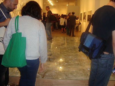
You enter Outside In, the group show at LaViolaBank gallery, by stepping up on a raised platform covered in cracked glass. People, understandably, paused hesitantly before crossing over it when I went to the opening Wednesday night. Under the chatter of the crowd, you could hear (and feel) the glass shattering beneath your feet. This makes for quite an introduction to the exhibition, which explores the personal/dreamy/unreal side of landscape. (LaViolaBank happens to be a block from my apartment, so not even lobster night could keep me away from the opening.)


Mira O’Brien’s aptly titled Glass Floor is laminated glass over photographs whose spreading geometric patterns mirror [get it, to mirror/on a mirror? no?] the cracking patterns of the glass. I enjoyed walking on the art, to see the art, while participating in the destruction of the art, in a visceral sense. The seascape beneath seemed a little insipid, like a stock nature scene. Maybe I was too distracted by the people to contemplate it. Either way, I enjoyed it overall. More on the project and her work on her website.

I also liked the charcoal drawings of Marina Berio. It probably looks like a photographic negative, which it was based on, in the jpeg below. The charcoal’s softer edges and matteness transformed the atmosphere of the piece. In a sense, these were the most literal pieces in this rather dreamy show, but by changing medium I thought they gained a greater atmospheric value. If you’re in the neighborhood before October 18, have a look.