Doing Dumb Stuff?

Stills from video “I will not make any more boring art”, in which Baldessari writes that phrase repetetively

 “John Baldessari, the 79-year-old conceptualist, has spent more than four decades making laconic, ironic conceptual art-about-art, both good and bad. His style is familiar and recognizable, wry and dry: It usually incorporates a photo or grid of pictures, often black-and-white and grainy, with the vibe of a seventies issue of Artforum; text of some kind; a found object placed casually; a video or maybe a newspaper clipping or some other element taken from popular culture. The approach is hugely influential, setting the precedent for interesting artists like Cindy Sherman and David Salle. In a sense, Baldessari imagined a large circular room with a hundred entrances and exits. Thousands of artists could go through, and did. After a visit to the Metropolitan Museum of Art’s retrospective, you’ll see that Baldessari’s children have overrun Chelsea.

And that’s the problem. Even a former student like Salle admits that “at least three generations of artists” doing “dumb stuff … is largely John’s fault.” Baldessari’s interesting niche bewitched too many people, creating a hackneyed academy of smarty-pants work that addresses the same issues in the same ways, over and over, just the way Baldessari and others of his generation did 40 years ago.”

 -Great article on John Baldessari (ostensibly inspired by the new exhibition at the Met) by Jerry Saltz
True?
Tips for Artists Who Want to Sell, John Baldessari

Video Killed the Art Star

I have not had a TV since I moved out of my parent’s house to go to college. At this point, it is a lifestyle choice, one that saves me from countless hours mindlessly flipping through channels and watching a rerun just for the sake of having something to watch. This has been a good decision for me on the whole. Add to this the ability to watch certain programs of choice via the internet, and I’m totally set. However, there are exceptions.
It began when I first realized how awesome the PBS series Art:21 is. How awesome is it? AWESOME. Then I kept hearing people mention a documentary called Herb & Dorothy, about a pair of art collectors called the Vogels (also PBS). Now, as you might have picked up from the clip above, there is a reality TV show called Work of Art, planned along the lines of Project Runway, for artists and Jerry Saltz is one of the judges. Certainly there is a movement from seriousness to frivolity in my exceptions but I would love to check it out–despite the ridiculous nature of a reality TV show based around art challenges. It airs tonight at 11 pm on Bravo. Or, for those sanctimonious fools without televisions, it is expected to be available on Hulu tomorrow.
More details on contestants here.

Whitney Biennial 2010: “Taste is like your…”

Robert Grosvenor, Untitled (images via Vernissage TV)

The Whitney Biennial reminds me of a lovely old Swedish saying my mother used to tell me, “Taste is like your ass–divided.” Somehow I saw 2010 Whitney Biennial and came out with the exact same reaction as Jerry Saltz (his piece in New York Magazine is probably the best)- and yet to a different conclusion. He left the Whitney Museum with a “giant burst of happiness for the infinite creativity of America” and I left with a vague sense of blahness that not even some stellar pieces could enliven.

Piotr Uklanski, Untitled

There was work on display that surprised and challenged me, and that I loved. Piotr Uklanski‘s gigantic cloth wall was stunning. Charles Ray did images of flowers. They were simple and good–and how refreshing among all the pieces to see work that didn’t feel the need to be deep or explore issues to prove itself but just to be. Robert Grosvenor‘s work incited a visceral reaction in me, with its combination of textured red and glossy steel that I wanted to touch. It was simple and approachable. And I was startled by the range of great video installations that needed more time than I had the evening I went to see them.

Charles Ray, Installation View

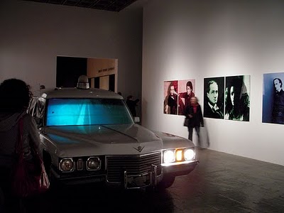
On the other hand, some of the more popular works left me unimpressed. The Bruce High Quality Foundation‘s hearse video was OK, but pedantic (and personally I would be happy never to see another car of any make or model in a gallery again). Nina Berman’s photographs of Ty Ziegel, a severely wounded marine sergeant, are certainly well shot, but I think people mistake how affecting their content is for the artist’s contribution.

Bruce High Quality Foundation, I Like America and America Likes Me

I agree that having a smaller show was nice; I agree that not having a theme might reflect a more authentic plurality of artistic practices than what a curator might impart; I agree there is room for less bombastic exhibitions. This year’s Biennial is all those things. If those are the effects of being on a budget, then hail and well met. I even agree that there is no way to produce a biennial that would be so good everyone would agreed it showed the best of American art. But certainly the best American art is less blah, as many pieces were, and more compelling?

But I take that back. The danger of the Whitney Biennial is that as the biennial of American art, people feel they are supposed to come away with pronouncements about the state of the visual arts in America. This exhibition itself is less presumptuous, yet its “cross section of contemporary art production” hardly escapes the unmanageable expectations of people, including my own. Let’s just say you can expect to see a varied, interesting exhibition whose viewing will probably contain a few passionate reactions and a few shrugs.