 Robert Grosvenor, Untitled (images via Vernissage TV)
 The Whitney Biennial reminds me of a lovely old Swedish saying my mother used to tell me, “Taste is like your ass–divided.” Somehow I saw 2010 Whitney Biennial and came out with the exact same reaction as Jerry Saltz (his piece in New York Magazine is probably the best)- and yet to a different conclusion. He left the Whitney Museum with a “giant burst of happiness for the infinite creativity of America” and I left with a vague sense of blahness that not even some stellar pieces could enliven.
 Piotr Uklanski, Untitled
There was work on display that surprised and challenged me, and that I loved. Piotr Uklanski‘s gigantic cloth wall was stunning. Charles Ray did images of flowers. They were simple and good–and how refreshing among all the pieces to see work that didn’t feel the need to be deep or explore issues to prove itself but just to be. Robert Grosvenor‘s work incited a visceral reaction in me, with its combination of textured red and glossy steel that I wanted to touch. It was simple and approachable. And I was startled by the range of great video installations that needed more time than I had the evening I went to see them.
 Charles Ray, Installation View
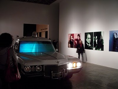
On the other hand, some of the more popular works left me unimpressed. The Bruce High Quality Foundation‘s hearse video was OK, but pedantic (and personally I would be happy never to see another car of any make or model in a gallery again). Nina Berman’s photographs of Ty Ziegel, a severely wounded marine sergeant, are certainly well shot, but I think people mistake how affecting their content is for the artist’s contribution.

B
ruce High Quality Foundation, I Like America and America Likes MeI agree that having a smaller show was nice; I agree that not having a theme might reflect a more authentic plurality of artistic practices than what a curator might impart; I agree there is room for less bombastic exhibitions. This year’s Biennial is all those things. If those are the effects of being on a budget, then hail and well met. I even agree that there is no way to produce a biennial that would be so good everyone would agreed it showed the best of American art. But certainly the best American art is less blah, as many pieces were, and more compelling?
But I take that back. The danger of the Whitney Biennial is that as the biennial of American art, people feel they are supposed to come away with pronouncements about the state of the visual arts in America. This exhibition itself is less presumptuous, yet its “cross section of contemporary art production” hardly escapes the unmanageable expectations of people, including my own. Let’s just say you can expect to see a varied, interesting exhibition whose viewing will probably contain a few passionate reactions and a few shrugs.


